
Adobe Illustrator, 18x24 inches, paper
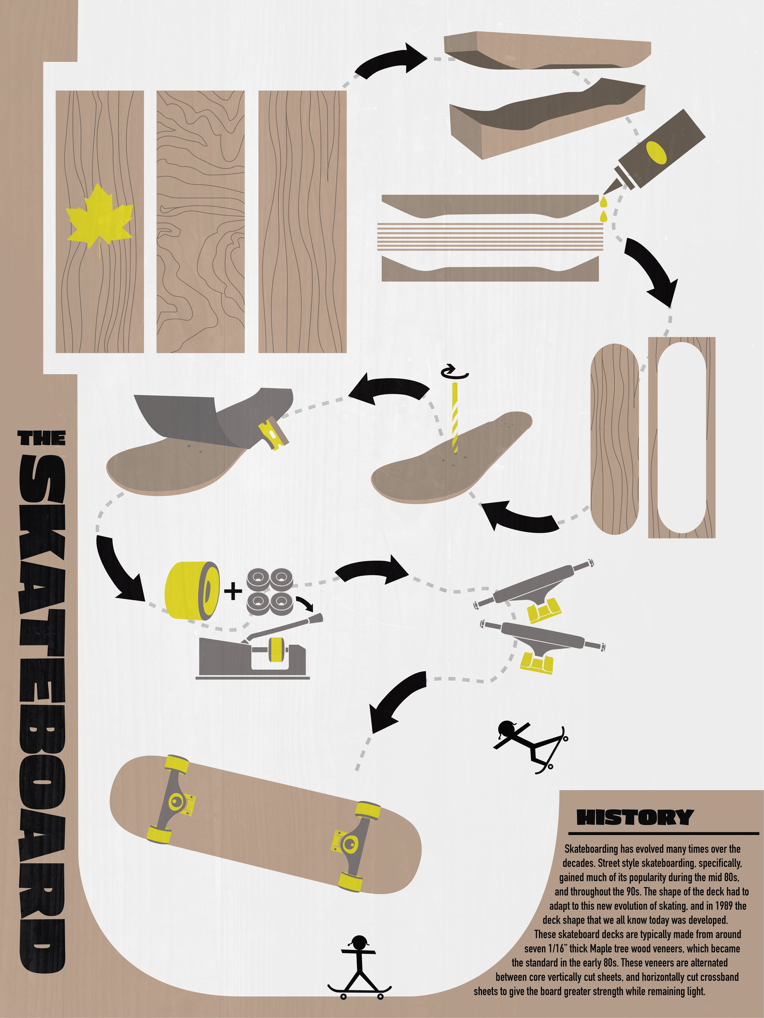
Construction of a skateboard
The unconventional process was based on an item that can be found in a department store. I began to think of items that I use in my day-to-day life, while simultaneously thinking of items that have significantly impacted me. Which resulted in me choosing the skateboard. I used a limited amount of colors within the poster but wanted to make sure that one of the colors in my limited palette would grab the viewer’s attention. Through trial and error with different colors, I went with a yellow that complemented the tan but was high-value enough to give another layer of depth and visual interest. I scaled up the artboard and spaced out the items. This allowed me to balance out the composition and reduce the cramped hand-illustrated graphics.